7 Pastel Kitchen Ideas That’ll Instantly Brighten Your Space
Here’s the truth: a pastel kitchen is basically an instant mood booster. Soft colors, sunny vibes, and just enough playfulness to make your morning coffee taste better.
If you’ve been flirting with the idea of pastels but don’t want your kitchen to feel like a cupcake shop, I’ve got you.
These seven ideas balance chic and cheerful—no sugar rush required 😉
1. Paint Your Lowers, Keep Uppers Light
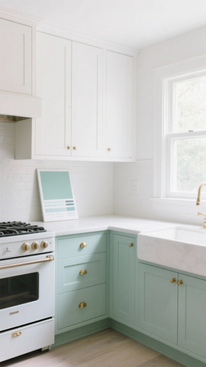
If you want a quick win, start with cabinets. Paint the lower ones in a soft hue—think dusty mint, mushroom pink, or a buttery pale yellow—and keep the uppers white or very light. You’ll get color without overwhelming the room.
Why It Works
Color down low anchors the space. Light uppers reflect more light and keep things airy, which is clutch in smaller kitchens.
- Pairing tip: Mint lowers + white uppers + brass hardware = clean and classic.
- Sheen matters: Satin or semi-gloss is wipeable without screaming “high gloss diner.”
- Tester tip: Paint a big poster board and move it around the room for a day or two.
2. Go All-In On a Pastel Range or Fridge
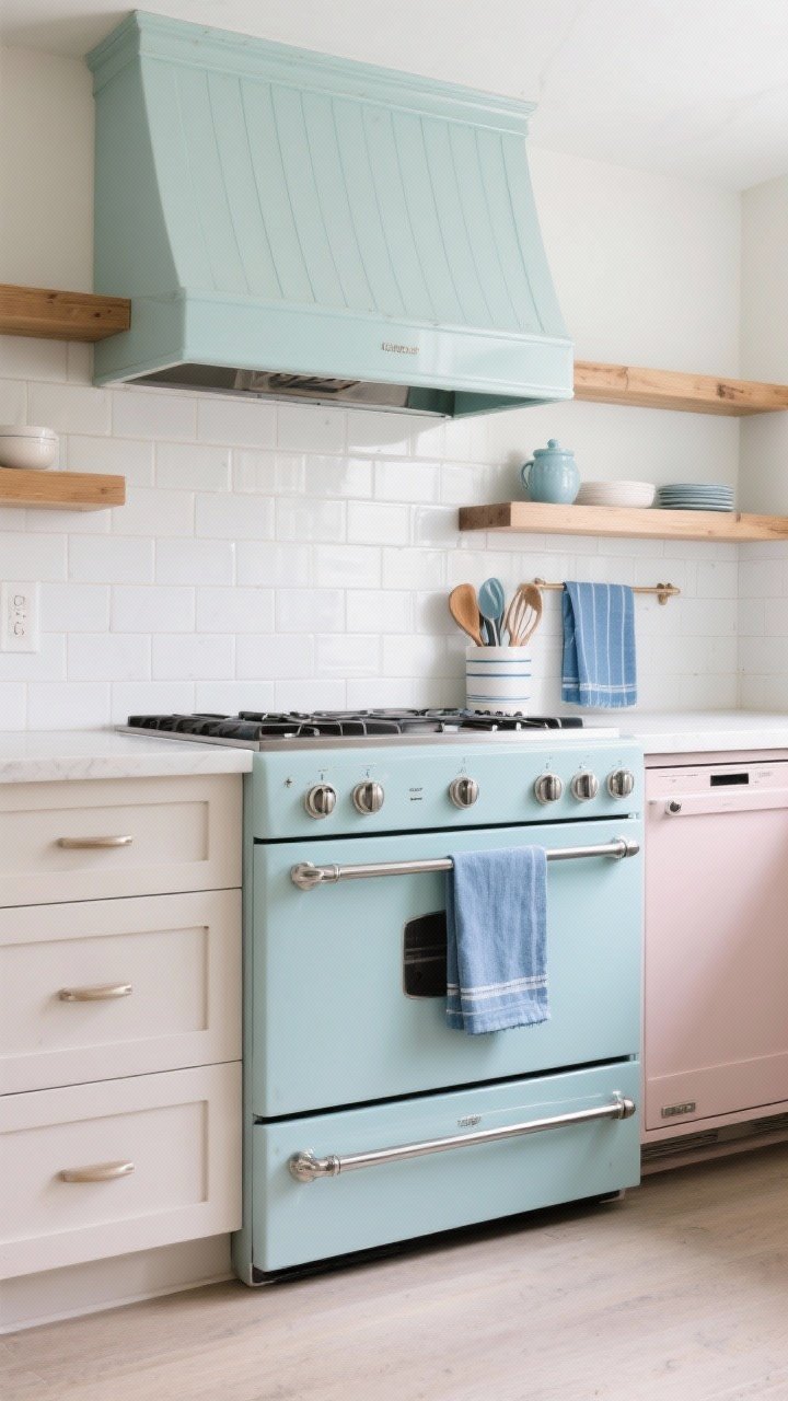
Ready to commit? A statement appliance in powder blue or blush is the star of the show. It’s bold but still soft, like wearing a cashmere sweater to a party.
How to Style It
Let your appliance be the diva and keep the rest neutral—white tile, pale counters, natural wood. Or echo the color in small doses (tea towels, utensil crock) for cohesion without matchy-matchy vibes.
- Finish harmony: Chrome hardware = cool pastels; brass = warm pastels.
- Backsplash buddy: Simple stacked white or cream subway tile keeps it timeless.
- Budget-friendly dupe: If a new range isn’t happening, try a pastel hood or panel-ready dishwasher with a painted face.
3. Swap In Pastel Backsplash Tile
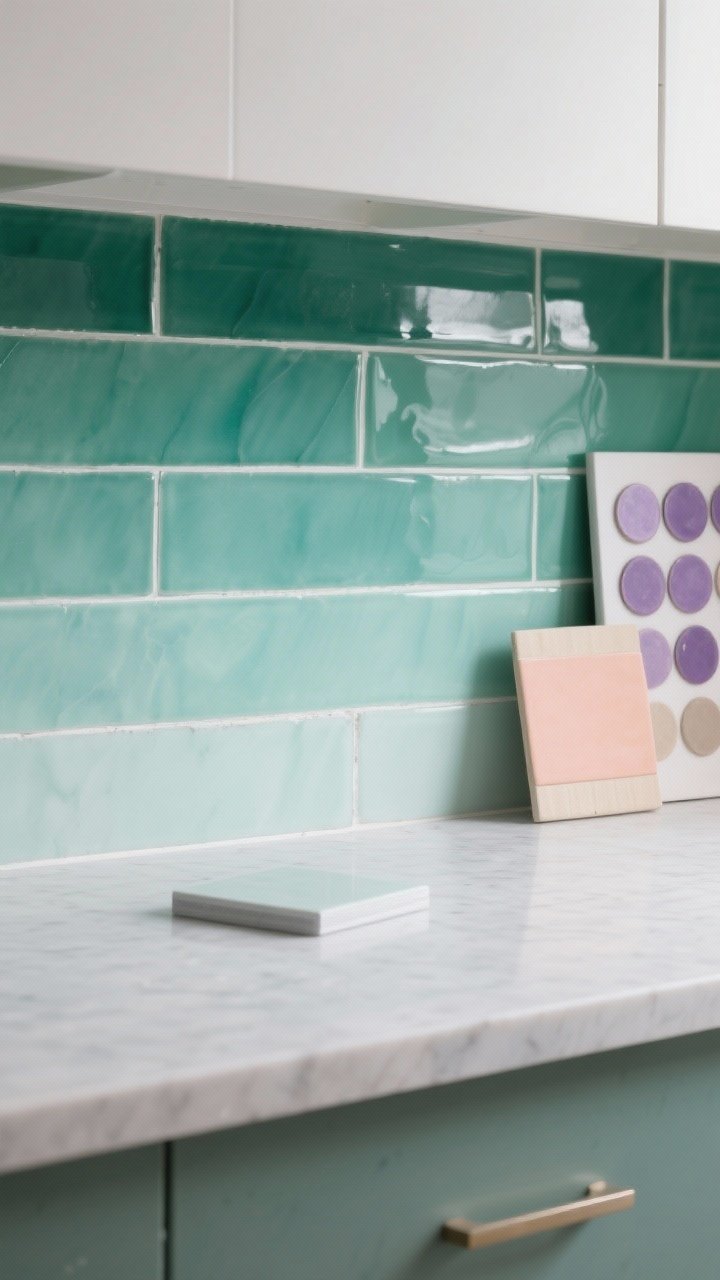
Tile is where pastels truly shine. A sea-glass green zellige, lavender penny rounds, or peachy-beige ceramic can transform the whole mood without changing cabinets.
Patterns That Play Nice
Stick to simple shapes and let the color do the talking. Or go gentle with a tonal gradient—think three shades of the same hue for a subtle ombré moment.
- Grout guidance: Off-white or light gray keeps it soft; dark grout can look graphic (still cute, just bolder).
- Sheen matters (again): Gloss bounces light; matte reads modern and calm.
- Counter pairing: Light quartz, honed marble, or butcher block are all pastel-friendly.
4. Layer Textures, Not Just Colors
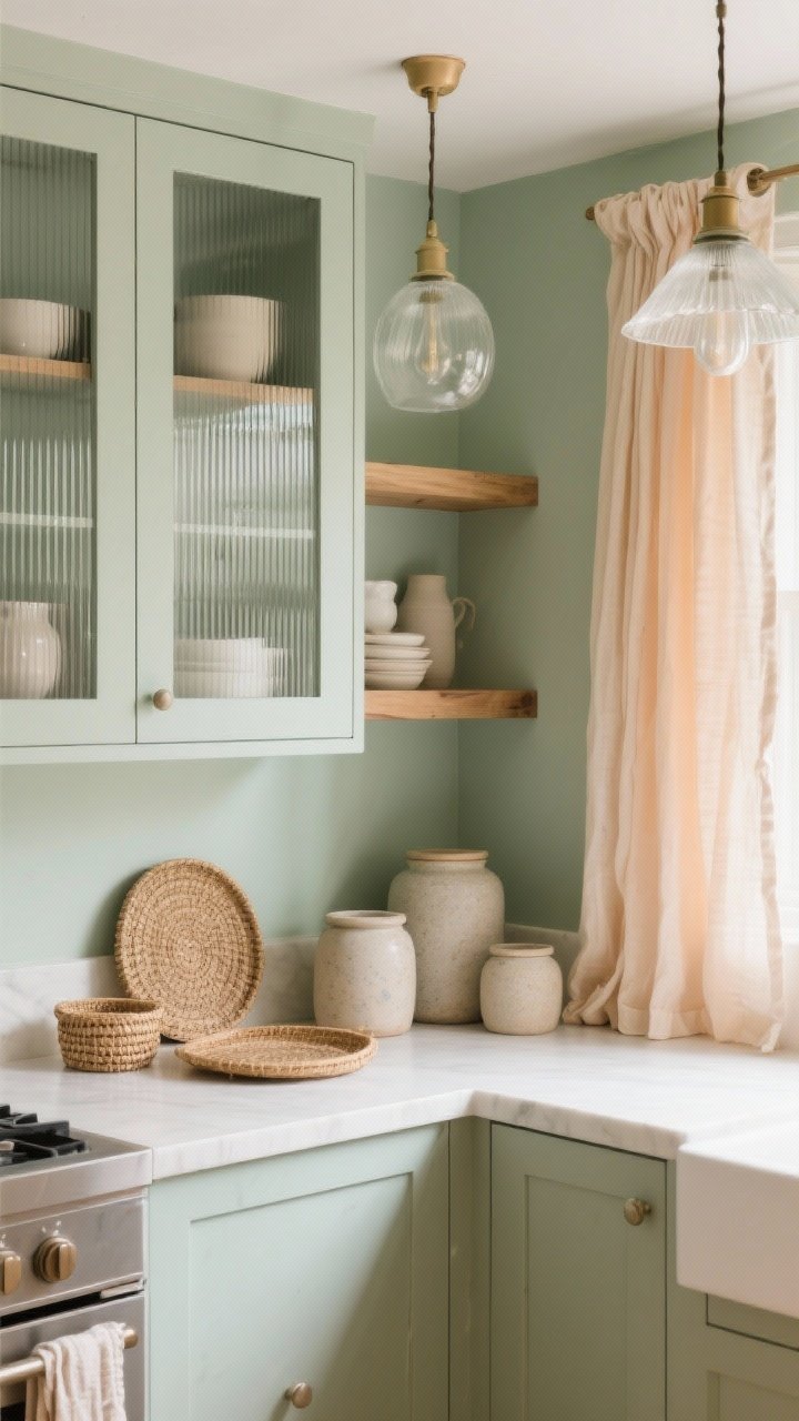
Pastels can fall flat if everything’s smooth and shiny. Add texture so the space feels intentional and grown-up—more “designer kitchen,” less “nursery chic.”
Mix Like a Pro
Combine matte ceramics, ribbed glass, linen, and natural wood. It’s the secret sauce that takes pastel from precious to polished.
- Try these combos: Ribbed glass cabinet doors + sage walls + oak shelves.
- Soft goods: Linen café curtains in a pale apricot or buttercream table runner.
- Small accents: Stoneware canisters, woven trays, and frosted glass pendants.
5. Create a Two-Tone Island Moment
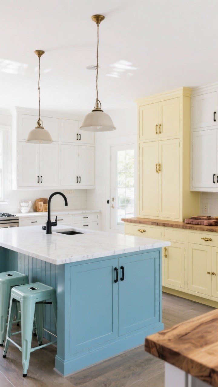
Your island is a perfect canvas for color. Paint it pistachio or powder blue and keep perimeter cabinets neutral. It feels customized without redoing everything.
Countertop + Hardware Combos
Warm pastels love walnut or butcher block; cool pastels pop with white quartz. Hardware can nudge the vibe traditional or modern in seconds.
- Modern vibe: Powder blue island + matte black pulls + white quartz top.
- Classic vibe: Pale yellow island + unlacquered brass + butcher block.
- Seating splash: Add pastel metal stools for a playful echo.
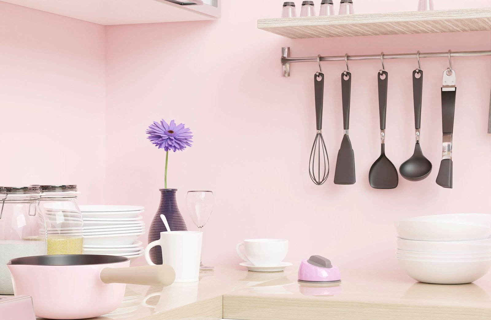
6. Style Open Shelves With Pastel Essentials
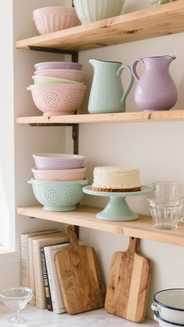
Not ready to paint anything? Style your shelves with pastel ceramics, vintage glassware, and enamelware. It’s low-stakes and super photogenic—yes, your shelfie dreams can live here.
What To Display
Mix functional pieces with a few decor moments so it doesn’t feel staged. And keep a tight color palette—your eyes will thank you.
- Color rules (loose, but helpful): Pick 2–3 pastels max and repeat them.
- Workhorses: Mixing bowls, colanders, pitchers, and cake stands in blush, mint, or lilac.
- Balance: Ground the sweetness with wood boards and neutral cookbooks.
7. Add Pastel Lighting And Soft Metal Accents
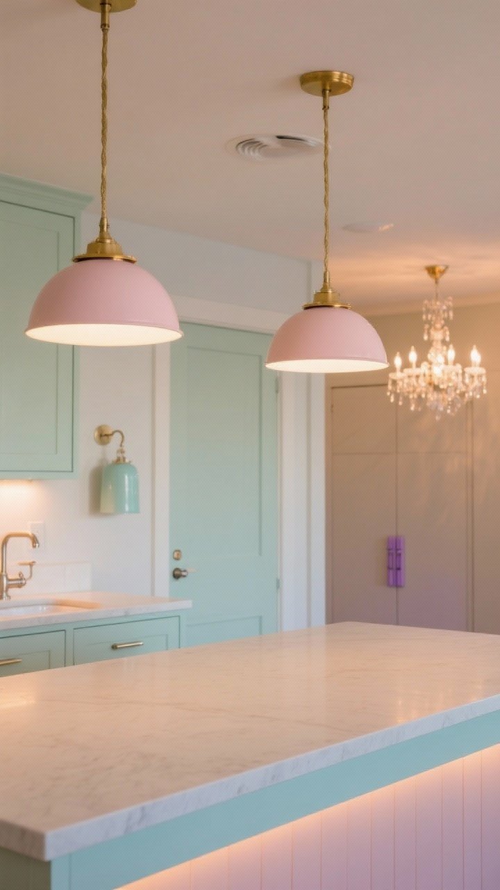
Lighting is the sneaky hero of a pastel kitchen. A pair of blush dome pendants, a mint enamel sconce, or even a pastel-coated chandelier can change the whole mood at the flip of a switch.
Glow-Up Strategy
Coordinate metal finishes with your chosen palette, and use bulbs that flatter color (FYI: 2700–3000K is your friend). A little shimmer adds sophistication.
- Finish pairings: Blush + brass, mint + polished nickel, lavender + black for contrast.
- Under-cabinet lighting: Warms up cool pastels and makes them feel luxe.
- Bonus accents: Pastel knobs on a pantry door or a painted toe kick for a wink of color.
Quick Color Guide (IMO):
- Mint/Sage: Fresh, calm, pairs with white oak and marble.
- Blush: Soft and flattering, loves warm brass and cream.
- Powder Blue: Airy, coastal-adjacent, works with nickel and crisp white.
- Pale Yellow: Sunny and nostalgic, sings with butcher block and beadboard.
- Lavender: Unexpected and chic, pair with black accents to ground it.
Practical Tips So You Don’t Regret It Later
- Sample large: Paint swatches look lighter in daylight and darker at night—test both.
- Balance sweetness: Add black, wood, or stone to keep things from reading too cutesy.
- Keep it clean: Pastels show scuffs less than stark white, but use scrubbable paints on high-touch zones.
- Future-proof: Put your boldest pastel on pieces that are easy to swap (lights, stools, accessories).
Pastels don’t have to be precious—they can be elevated, easy, and seriously joyful. Pick one idea to start (I’d vote the two-tone island or shelf styling), and build from there. Your kitchen is about to feel brighter, softer, and way more “you.” Now go make a latte that matches your cabinets—strictly for the aesthetic, of course.